This is a personal history about my interests in typefaces. It is not a technical article for fonts or typefaces or type design.
Arabic Type Design class, was the main reason to write this article.
You’ll notice I will use the words font and typeface interchangibly. They mean the same.
Brief History
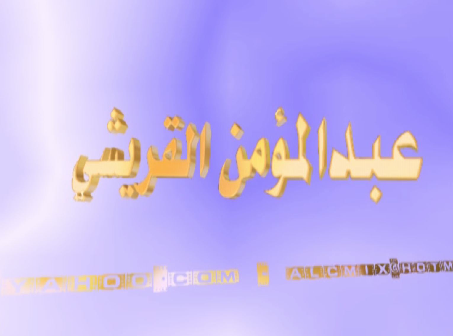
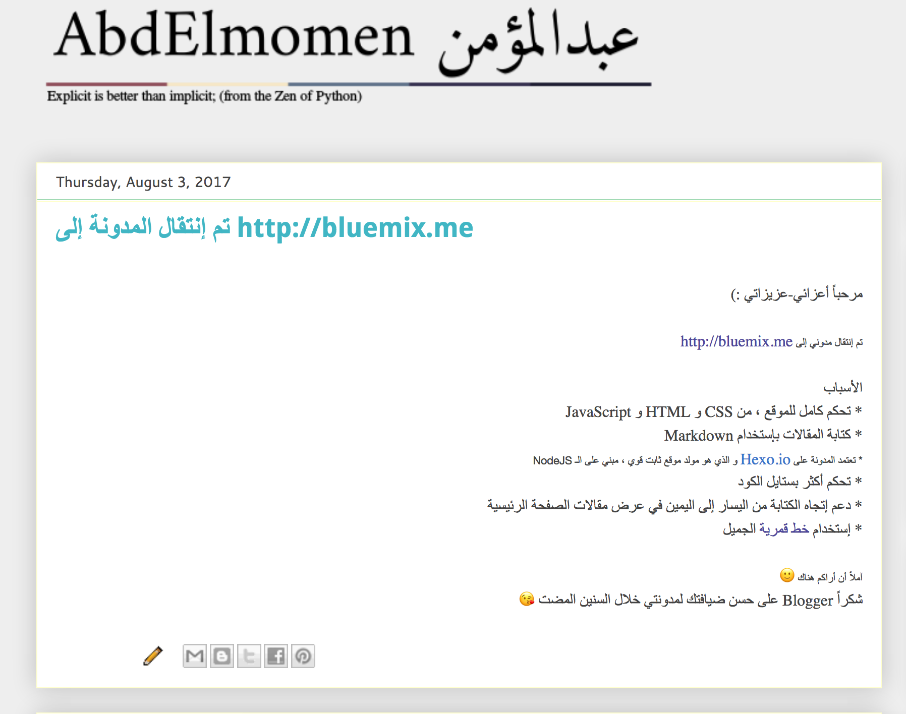
The farthest memory I remeber about recognizing typefaces (fonts) is distinguishing between Arial and Tahoma. The other notice, was never selecting the default typeface for any software to use, especially Arial. Below, are some of the screenshots of videos made by me during my teenage (between 2005, 2006 and 2007). You’ll not see Arial 😃.
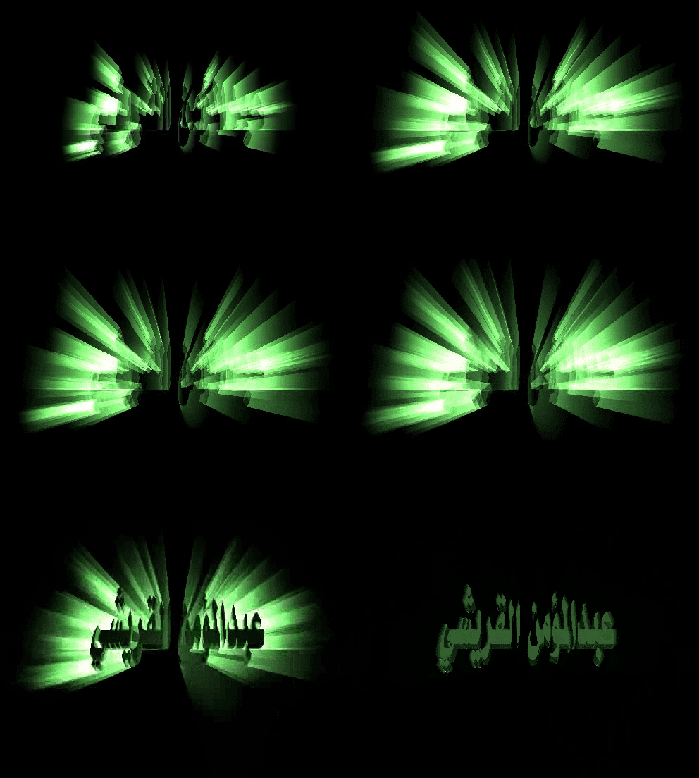
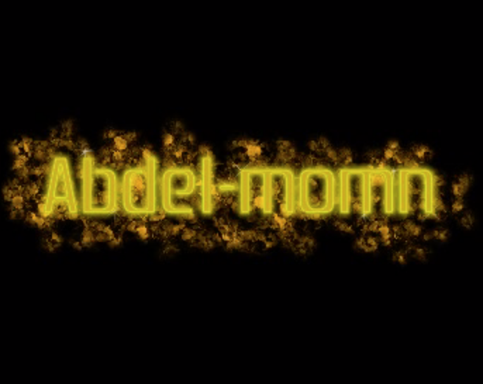
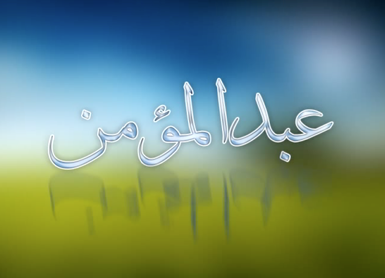
At that time, and even before 2005, Yahoo! Messenger and Camfrog, had also an impact in making me realize and took care of my written chat text color, size, and font, and trying to use something with different scheme from other users (chatters). I remember installing some application for Camfrog, that allowd me to use custom text color instead of the the predefined, fixed, list of colors built in Camfrog.
At one time, I installed a custom font (from CDs), and used it on Camfrog chat settings. Then, after very long time, I discovered, that this font only works on my own PC, and it is fall-backed to the default app font on other users. The issue there was I couldn’t separate between system fonts, and user-installed fonts.
Then, I started to notice the typefaces used in movies or series subtitles, on TV or when played on my PC/Laptop.
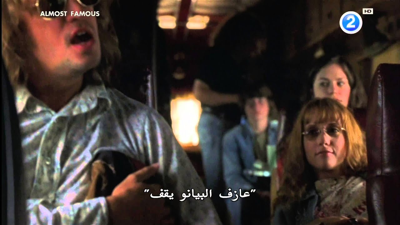
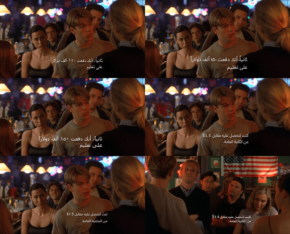
Back, when watching videos with subtitles, the defacto-standard videos application player at that time (before 2010s) was VLC (because it supports Arabic subtitles encoding, specifically, ISO 8859-6 or Windows-1256) and spending most of the time changing typefaces, till I get setteled on one. The last time I remeber was Palatino Sans Arabic, before the era of Cinemana.
From 2012-2014, when studying for a master degree, the thesis was written using LaTeX, and I remember using a better version of Times New Roman (don’t remember the typeface name exactly). During the assesment and evaluation of the thesis, the session’s supervisor asked me if I am using a different typeface that is not Arial or Times New Roman, and I answered I am using Times New Roman. It was a lie, and felt (and feeling) ashamed about it. Days later, our department manager noted me about the typeface on my thesis (I don’t remember the exact words of him), but it was a note about my thesis font. Sometimes I wonder if it is one of the reasons that reduced my evaluation and assesment mark. Anyways.
There is something that needs to be confessed: In My old blog, there was an article written in 2014, lists some of Arabic Linotype fonts to be downloaded for free (hacked), and lots of them were designed by Nadine Chahine! It was the most viewed article on the blog. Now, it is archived since 2017. Apologies to Nadine (hoping my apologies be accepted 🙏🏼).

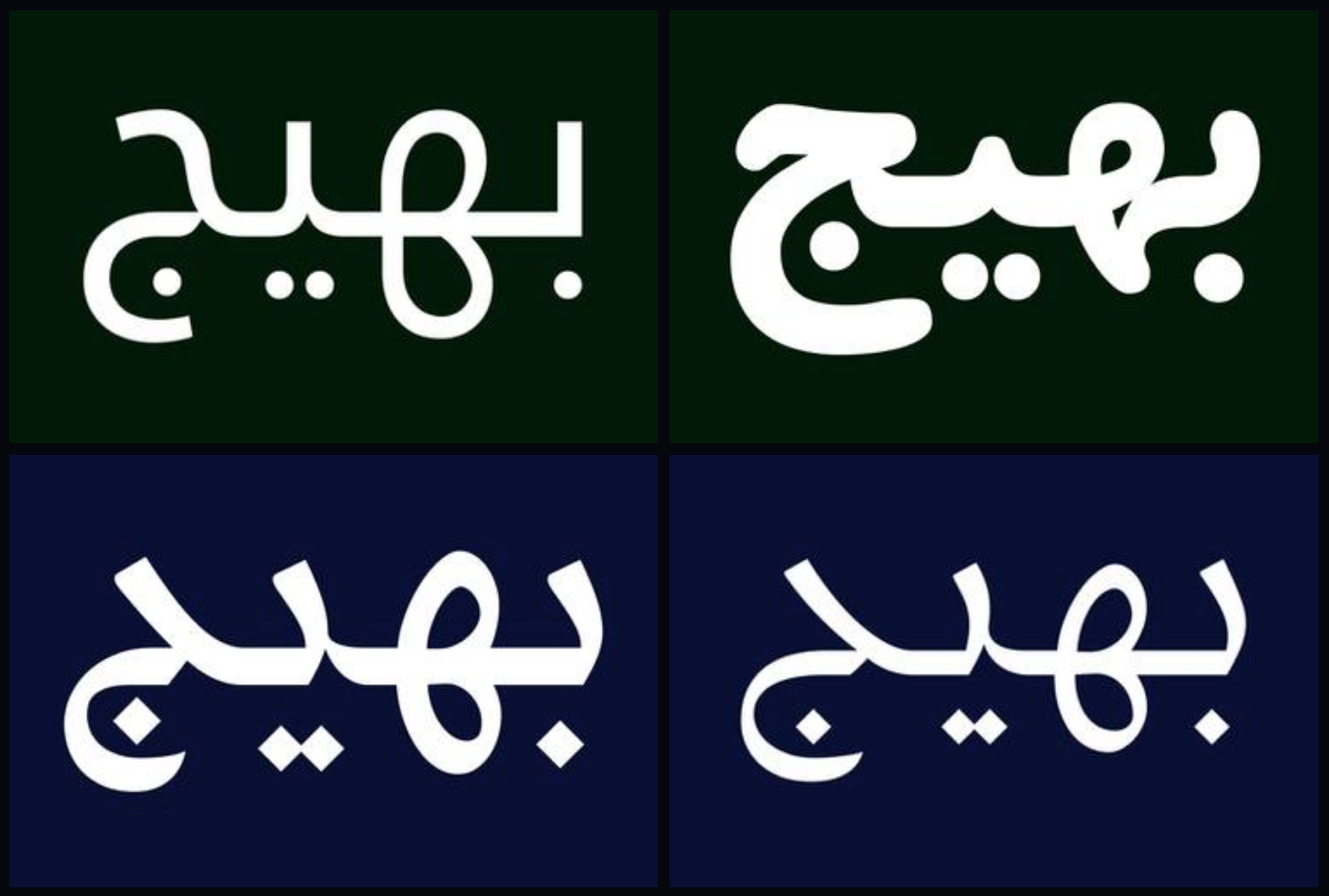
While surfing the Web, a project on DeviantArt, called BahijVirtualAcademy, was having high-qulity Arabic fonts, and they were 99% the exact of the original (hacked) typefaces. Some fonts are still in use on apps developed by me. It turns out, the author, has little modified the original fonts, and then released them as Bahij+OriginalFontName.
For example, the TheSans typeface, is renamed to BahijTheSans, and Koufiya to BahijKoufiya (Koufiya is a typeface designed by Nadine Chahine).
Bahij typefaces are copycats. If you compare the original font and Bahij_X_, you’ll get ~5% visual difference between them. If there will be apps to be developed by me in the future, the next apps shall and will not contain Bahij typefaces in them.
‘Fonts’ in mobile apps UIs
My favorite typeface library on Android was Calligraphy, that changes the typeface for the whole app; for iOS, I was relying on a static file for labels. on Flutter, it is very easy, to set the typeface for the entire app, and no library is needed.
TheSans
The first real use of typefaces was when starting (in my job) to develope mobile apps. There was a project, back in 2015, I remember how was I in love and satisfied with TheSans Arabic.
At that time, TheSans, was one of the best UI typefaces ever used. It is crisp-clear, compact but not narrow, elegant and different weights avaiable, and most importantly, it supports Arabic and English. The pirated version was used in the app (except for AlTameerHR, developed in years later, which uses Bahij TheSans). TheSans Arabic is not used today in apps designed and developed by me. A feeling of guilt when using it, and to be honest, it is outdated for me (but still, a great typeface).
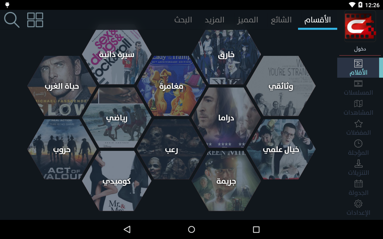
BahijTheSans, as a replacement for TheSans Arabic, is currently used in AlTameerHR, and my intent is to replace BahijTheSans with other, free, or paid, but original typefaces (read above about Bahij_X_ typefaces).
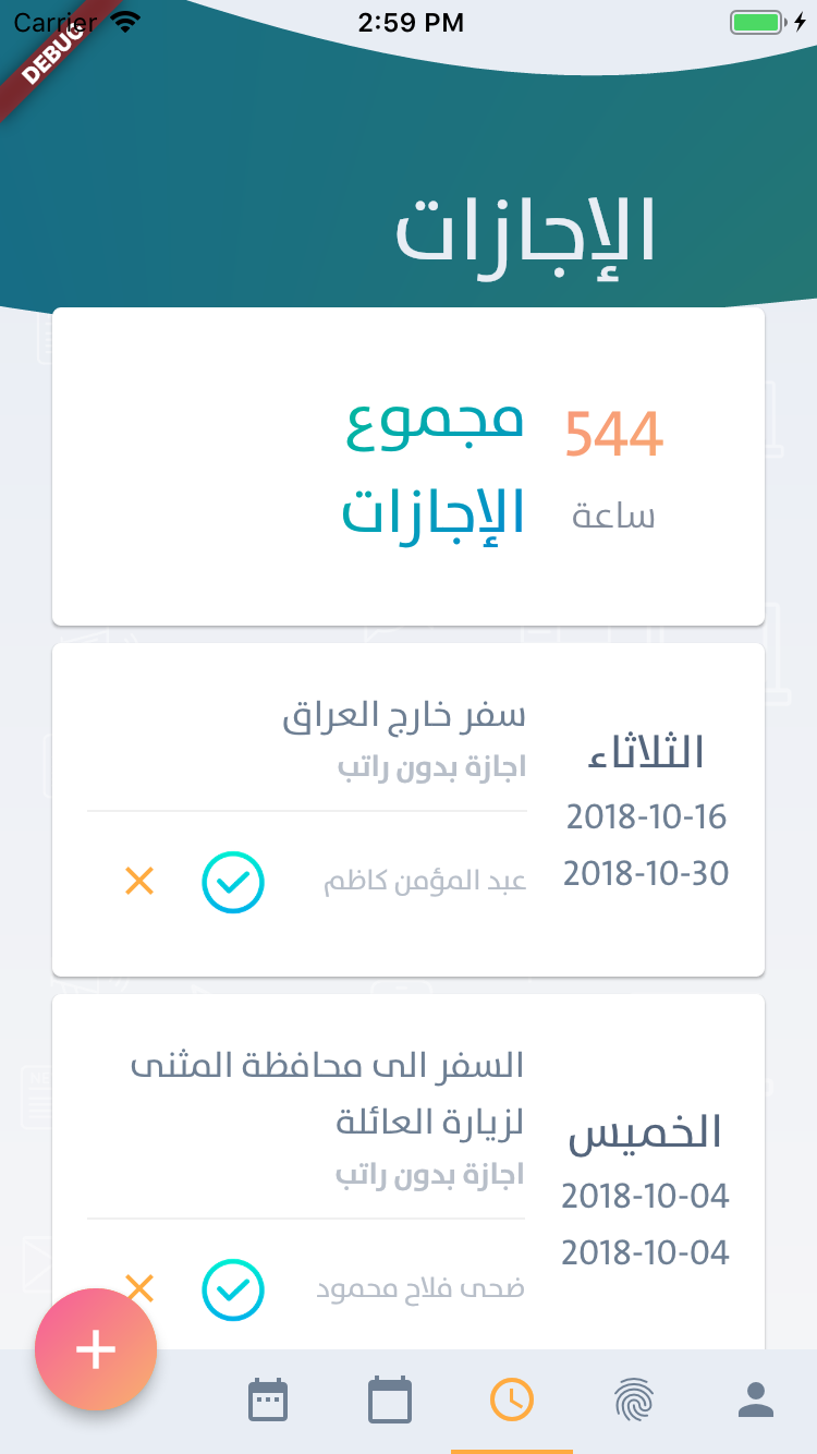
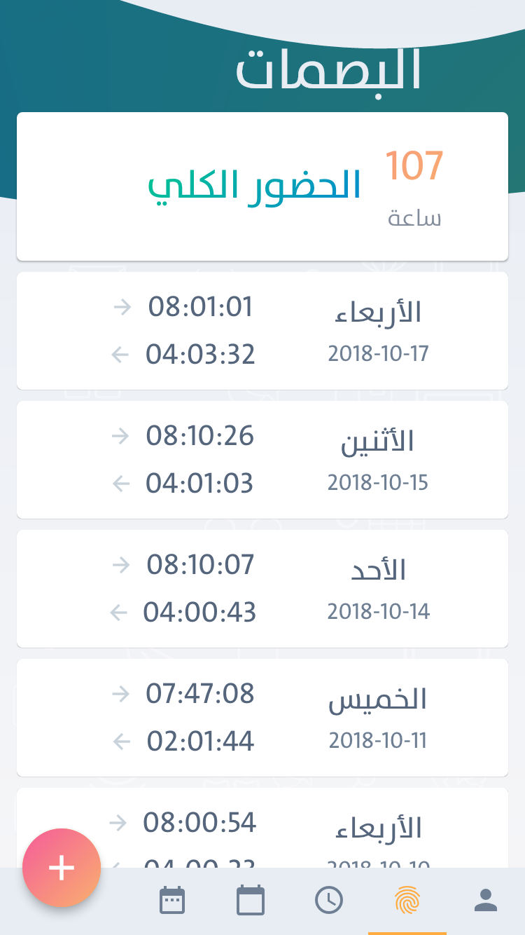
Neue Helvetica® Arabic
Since TheSans was used for a previous project, my curiosity was if there is a better one, but with the same quality metrics as with TheSans.
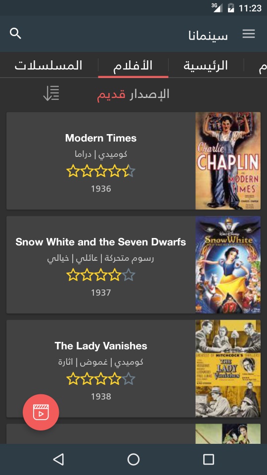
After releasing the fist version of Cinemana for Android, and after many trials, I got satisfied using the light, bold and normal weights of Neue Helvetica® Arabic font family. This font family is designed by Nadine Chahine. Back, in 2016, the pirated version was used.
Amariya
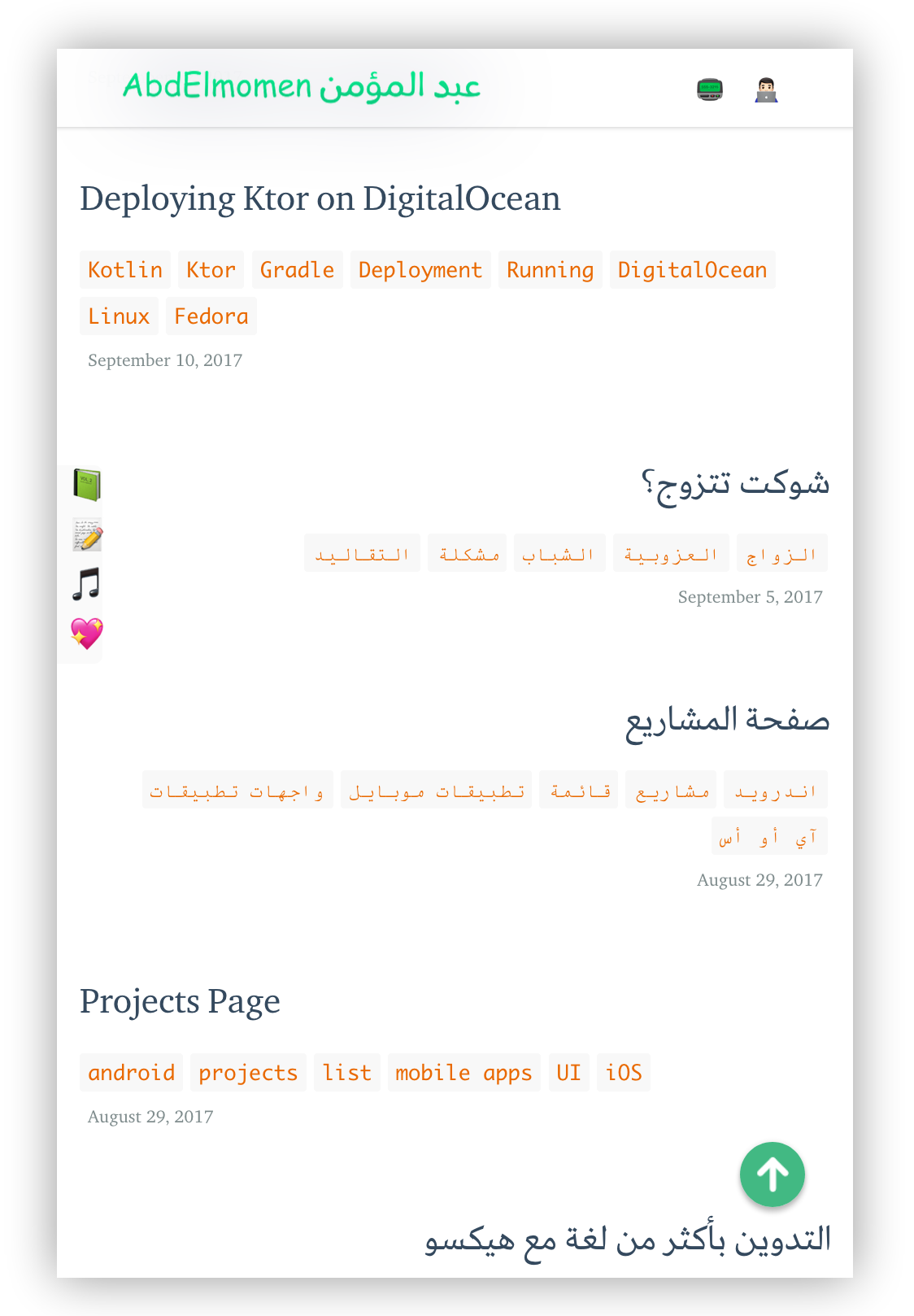
Purchasing Amariya, (قمرية, in Arabic), my first Arabic typface I bought for my personal blog, designed by Nadine Chahine. After that, moving to this blog, to have a custom typface installed on it, as you can see in the reasons why the move from blogger.com (I don’t know whether blogger.com supports custom typefaces or not, but, one of the reasons to move here was the use of a custom typeface).
GE SS Two
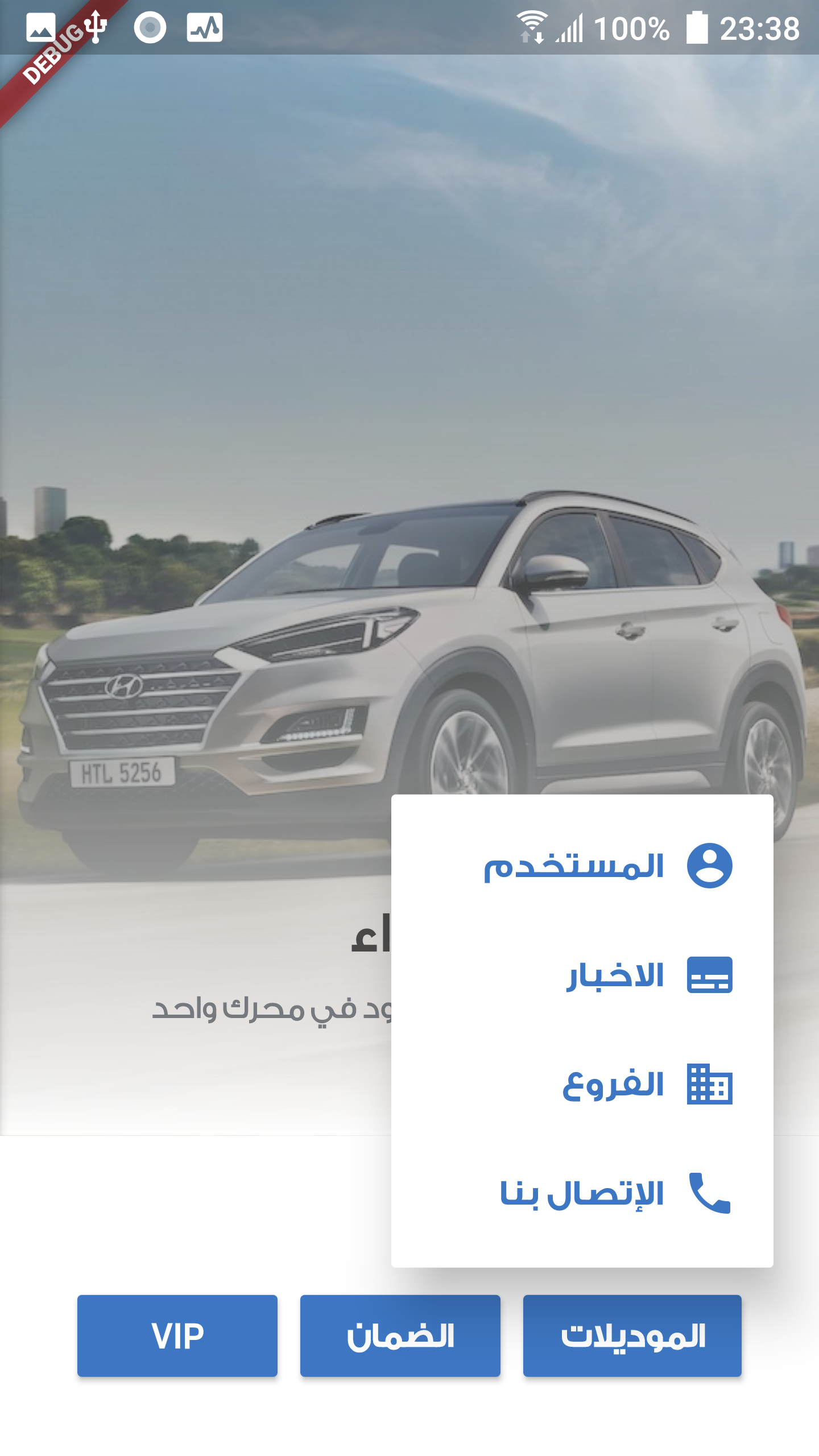
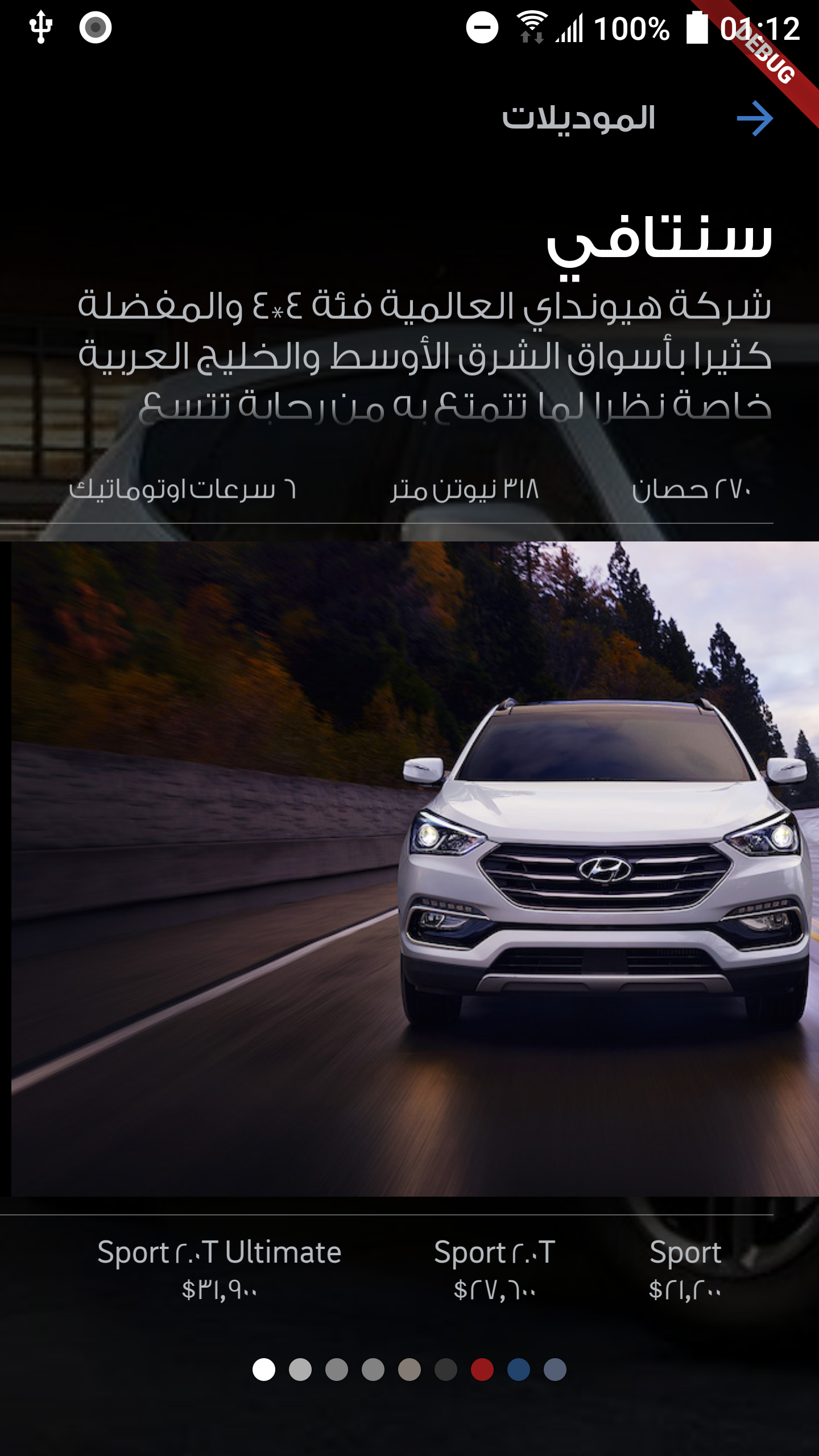
Hyundai GK-Auto, is a mobile app, for a Hyundai agent in Iraq. They want to have an app that is simple, intuitive, and world-class design and implementation. I couldn’t satisfy all of these general requirements without having to pick the perfect typeface. GE SS Two was the one. When you’re in doubt picking the right typeface for your design, choose GE SS Two.
It works with companies, agencies, that want to radiate confidence, trust, and professionalism. When you read words with GE SS Two, you get the feeling of you want to work/test their service(s). Below, there is a section, where lots of shots taken by me of things that has GE SS Two in their design. Its design is ahead of its time. There is one catch with GE SS Two; after purchasing GE SS Two, it was not supporting English :/.
Others
I’ll mention some typefaces, that are also has quality in its design, and used in some of the apps developed by me in my job.
Bahij Janna
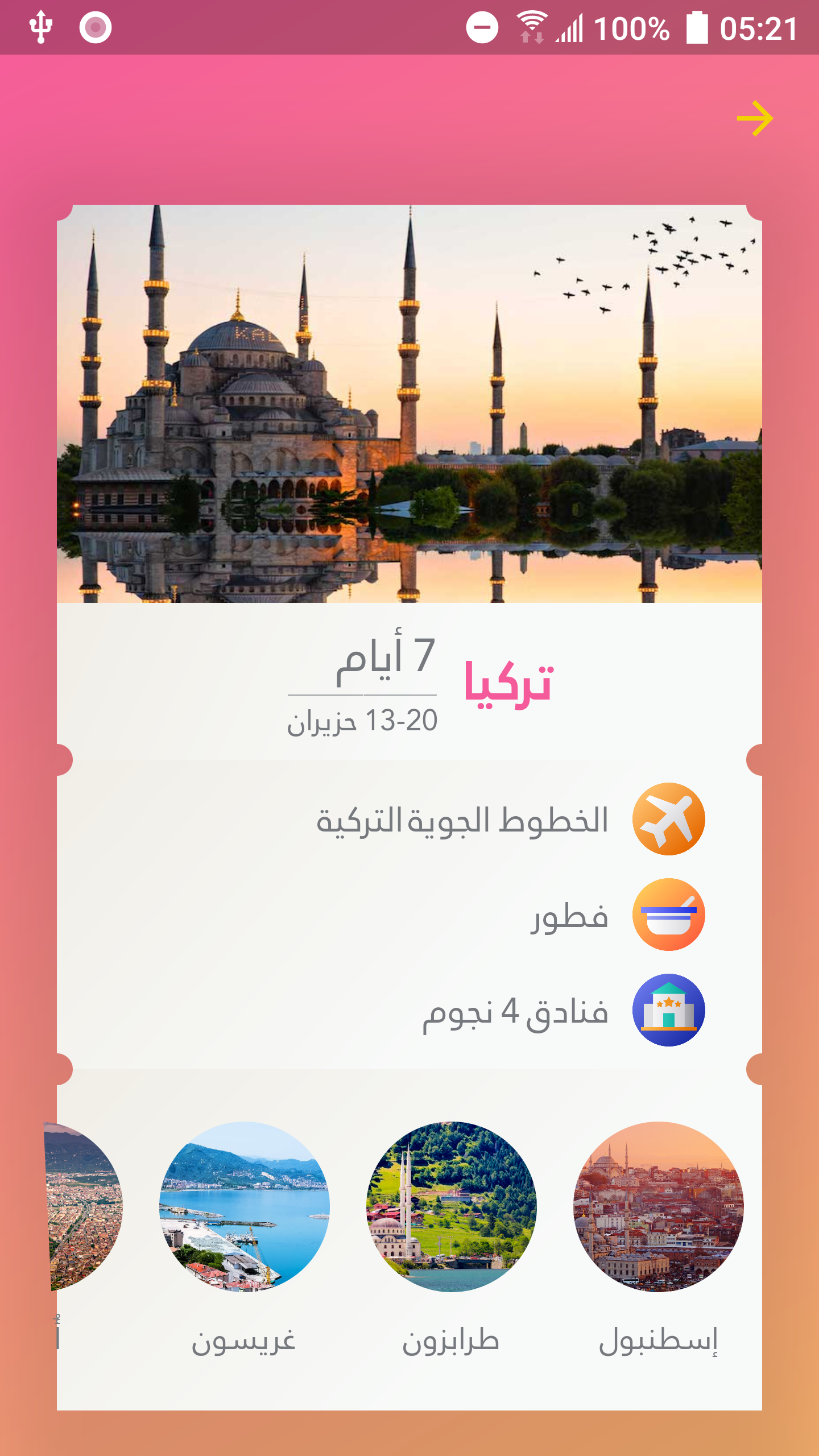
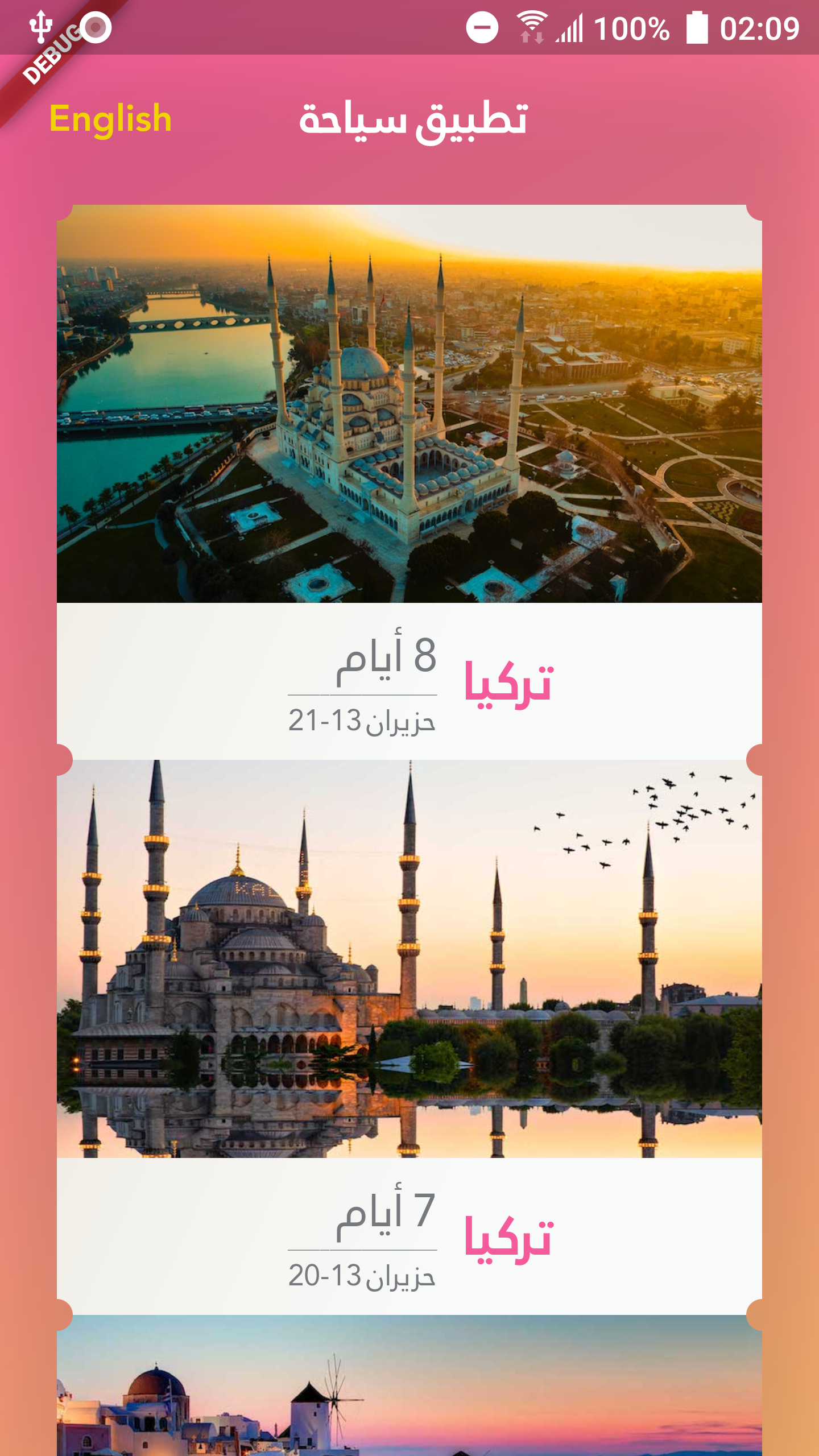
Yaseer
Yaseer, reflects the-not-so-serious personality, and it was used in this restaurant menu app.
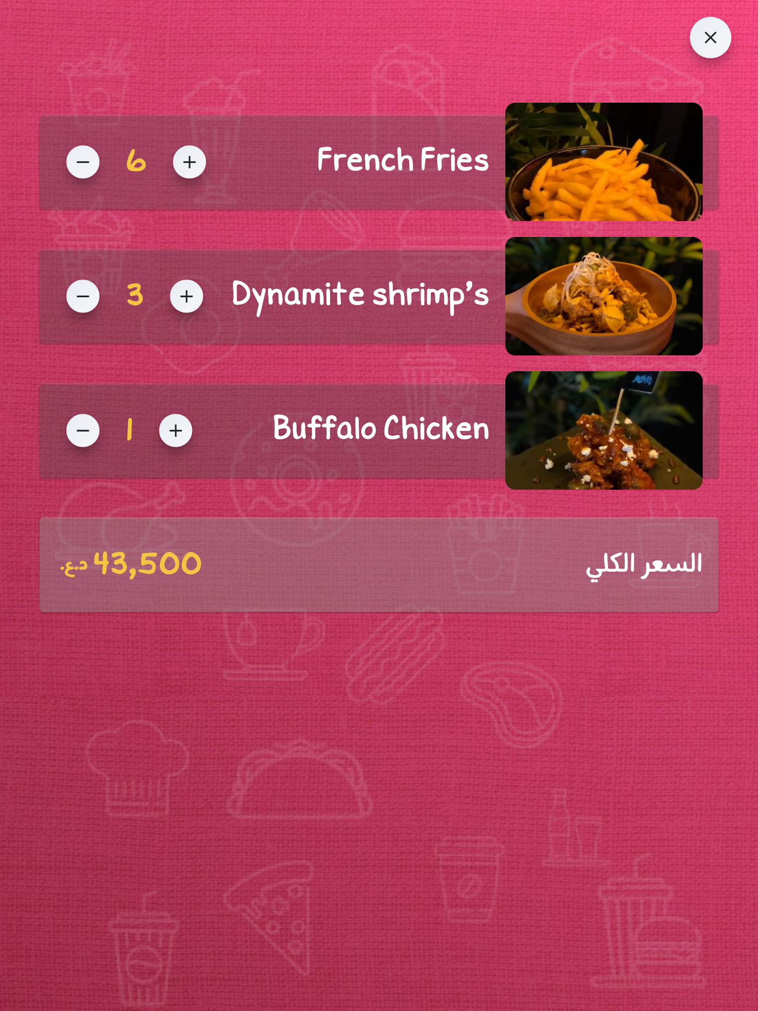
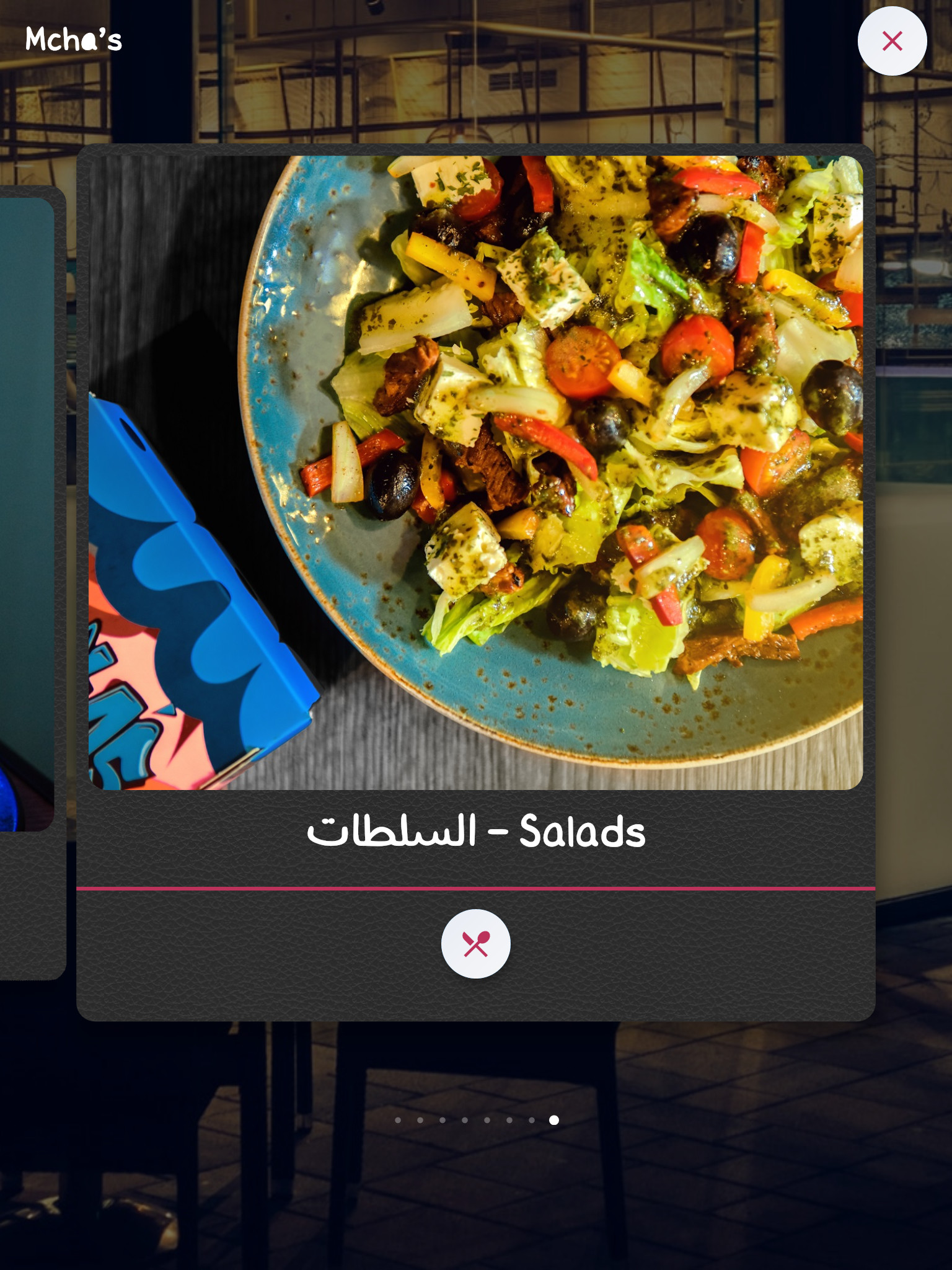
Shamel Family
I adore ffShamel Family typeface; they’re beautifly designed, professionally-crafted, and gorgeous. Supports multiple weights, but does not supports English. Here are some of the screenshots of a work-in-progress app. The typeface is designed by Fahad AlFarikh (Yaseer typeface is also designed by him).
Hunting GE SS Two
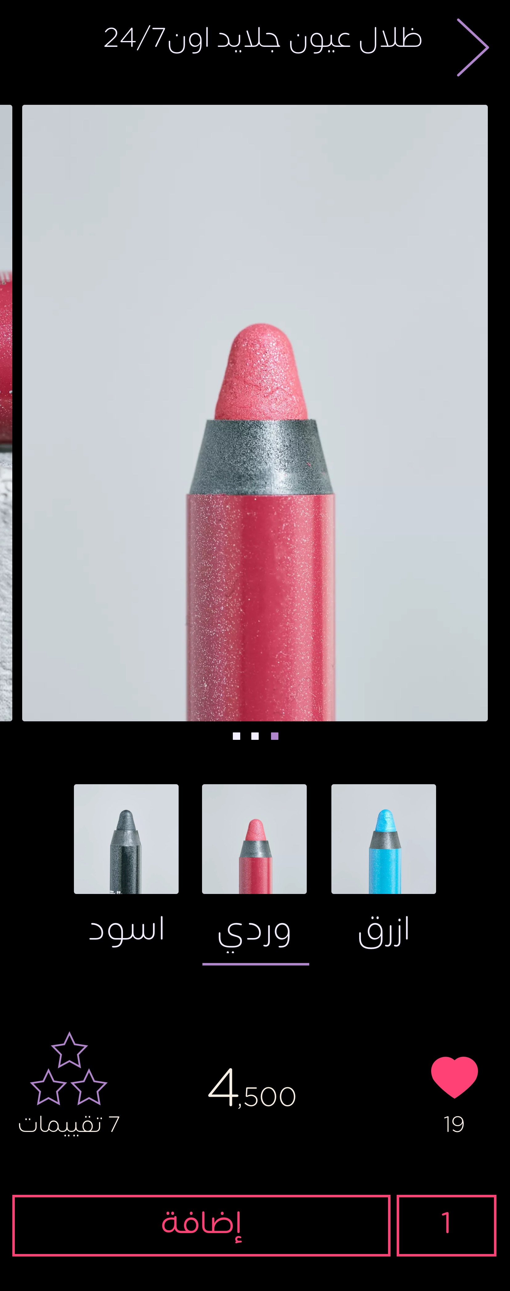
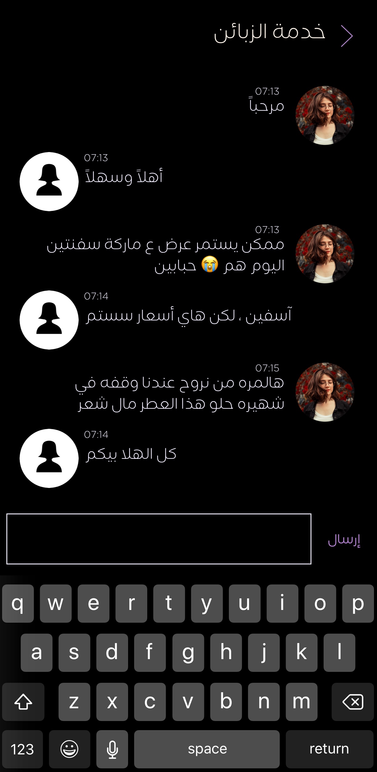
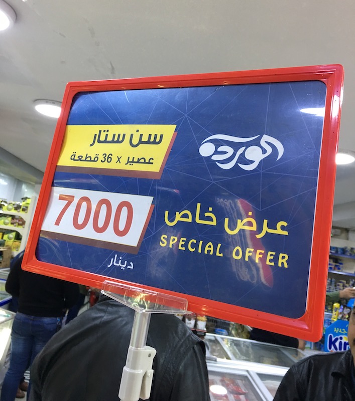
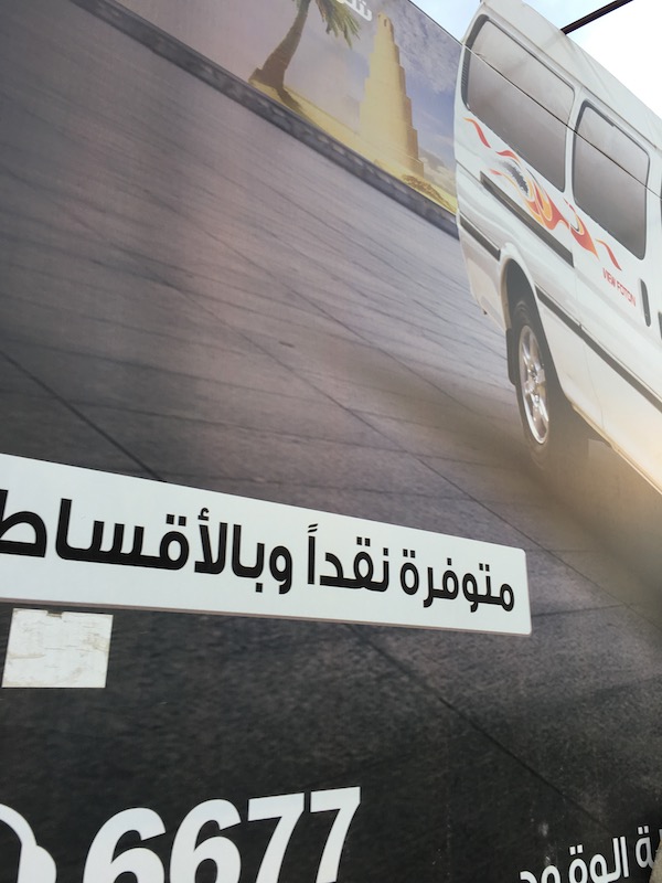
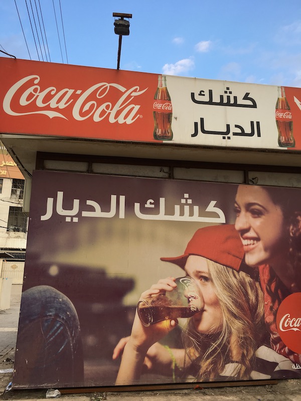
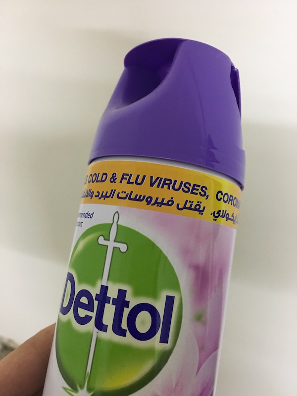
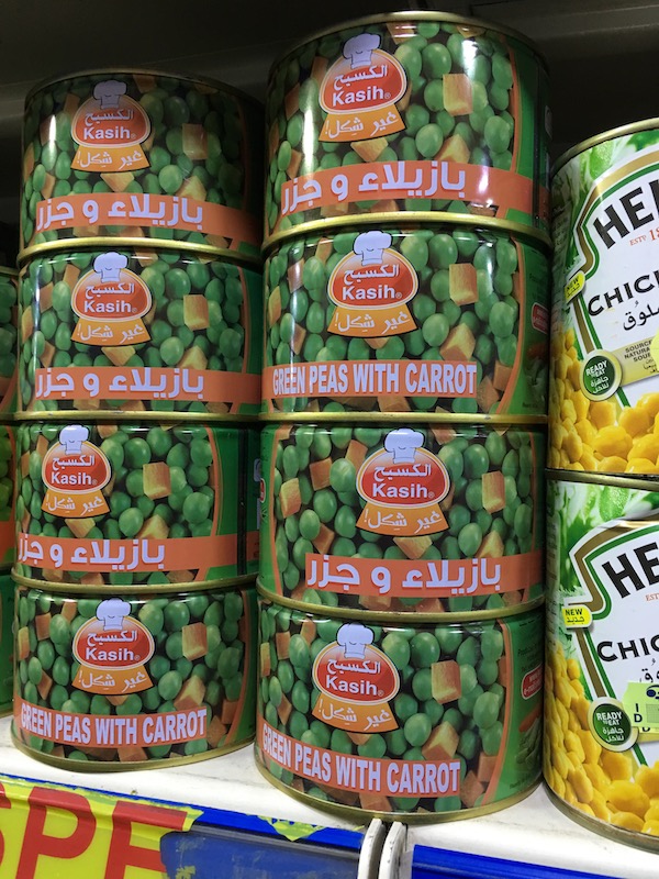
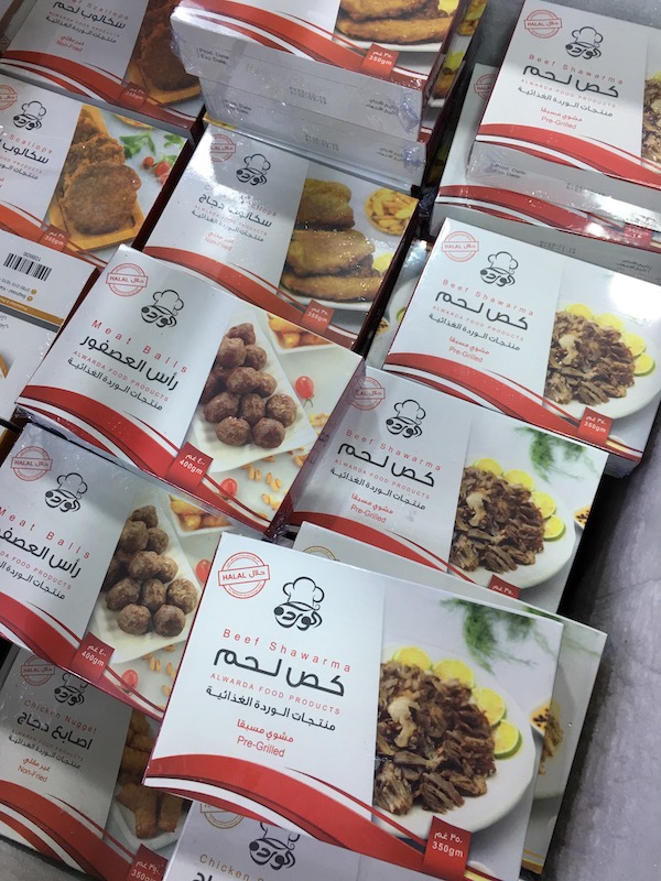
After falling in love with GE SS Two (see previous section), I started to notice the popularity of GE SS Two in every-day-life designs. It took me a couple of days for this task, from supermarkets, to shops, to my room stuff, ads, etc…
Collecting GE SS Two was very easy, since GE SS Two was popular and common in everyday life things. I don’t know if it is very popular here in Baghdad, because graphics designers like this typeface here, or it is also pervasive in other cities outside of our region.
Arabic Type Design Class
The main reason I wanted to learn type design was to publish as many free and open-source typefaces, and to enrich the poorness (lack) of free Arabic typefaces in the area. I wanted more, high-quality typefaces, other than, TheSans, Neue Helvetica Arabic.
It all starts with a tweet of Nadine Chahine; Couldn’t resist the eager to reply confirming the idea, and to start enrolling the course, no matter when it will starts, for how long, or what it costs.
I was having a little background doing some calligraphy drafts, on my spare time, in writing whatever comes to my mind (scratches).
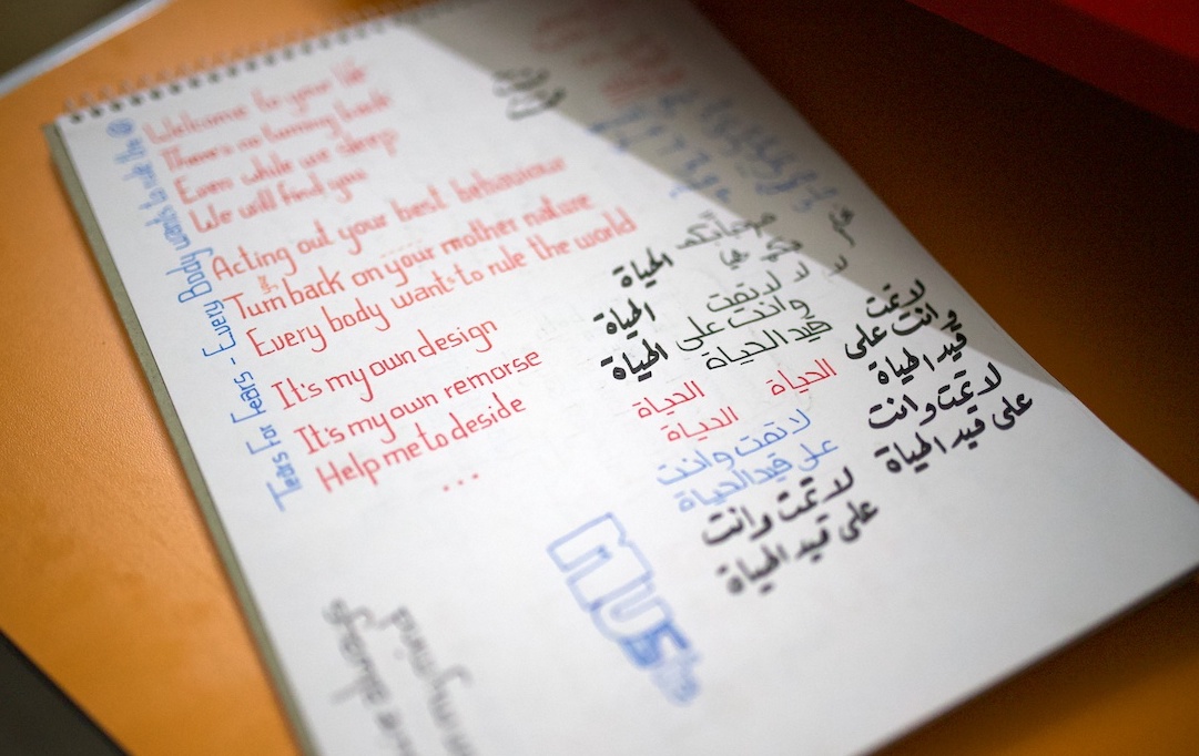
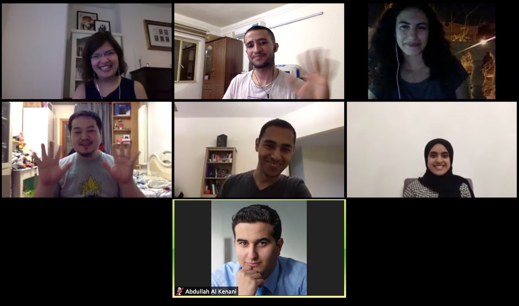
Few months later, Arabic type design class (🥁🎶) starts. The first session was in the midst of April, 2019.
One session was enough for me to have the pleasure seeing and speaking online with Nadine Chahine. After this session, more than a week was spent in reading Nadine Chahine’s Ph.D. dissertation related to reading legibility. Many things learned about typography, especially, for Arabic.
At first, I underestimated type design. Just because doing good (or somehow, #progressnotperfection) with calligraphy, that doesn’t mean learning and mastering type design will be easier and faster. Type design is the art of details. Words, not letters, what you should imagine of when desigining its constituent parts, i.e., letters. The essense of its heart lies in the following quote:
Type is a beautiful group of letters, not a group of beautiful letters.
It was Ramadan, and some of the sessions was starting at 19:00, coincedentally to be the breakfast time here in Baghdad. I was hurring to finish my prayers as soon as possible and to prepare some lightweight food (dates, and water) to start joining the session, and not to be late.
During all of the 10 type design sessions, the cooperative and delightful attitude by Nadine was dominate; fareness by taking time to enhance (edit) our homework typefaces.
Professionals are cursed with OCD :D. The first time I noticed Nadine enhancing a curve was taking long time; at first, it was out of her control, and was immersed deeply in it, and stops either when she realized it will take too long for her to get enhanced or until she get satisfied, and most times, not satisfied, and continue digging deeply with curves. And now I know how her typefaces are designed, with care and lots of time put for tiny edges and bump-free curves, all done with passion, emotion, and tensed deeply for each individual glyph.
One sidenote needs to be mentioned is that buying Glyphs that costs $300 and this course (850 €), was one of the expensive things (for me) on software I spent. Was it worthy? absouletely; is it everything I wanted to learn? IT IS, and more. I recommend (this is not an ad) entering future online arabic typography classes with Nadine Chahine. Already miss the meetings of these sessions.
Vibes
The aim for entering the Arabic type design class, was to create my own typeface. Vibes was my homework in this class. To be honest, I started designing the glyphs before the homework is assigned to me. I thought it was easy and I’ll finish it within less than a week, and I was wrong 😬. My start was scrutinizing Cairo, by which I was lucky being open source and designed using Glyphs. I learned from it, and starting my first glyph of Vibes with inspiration for one of the Cairo’s glyphs. Few days later, wiggly words started to appear. Then, words starts to appear like normal, and still, other words are irregular, especially when glyphs gets overlapped with each other.
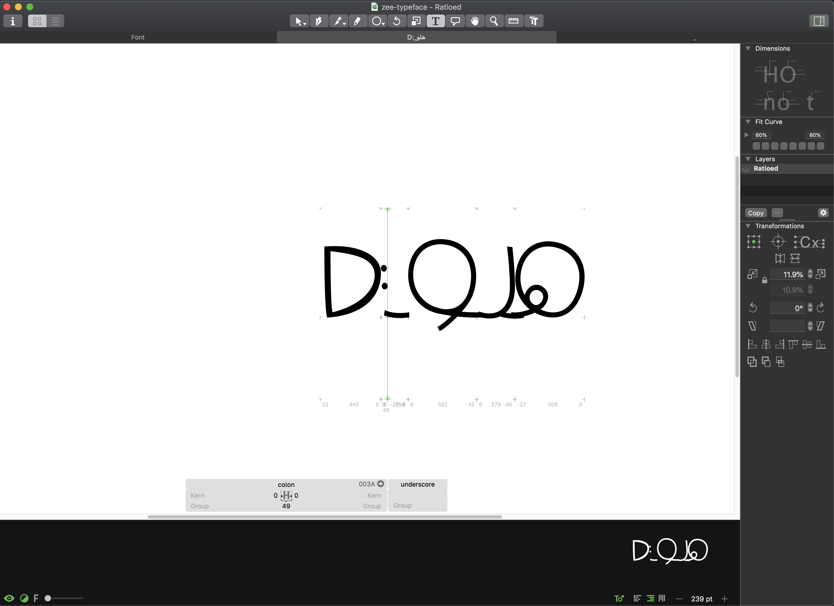
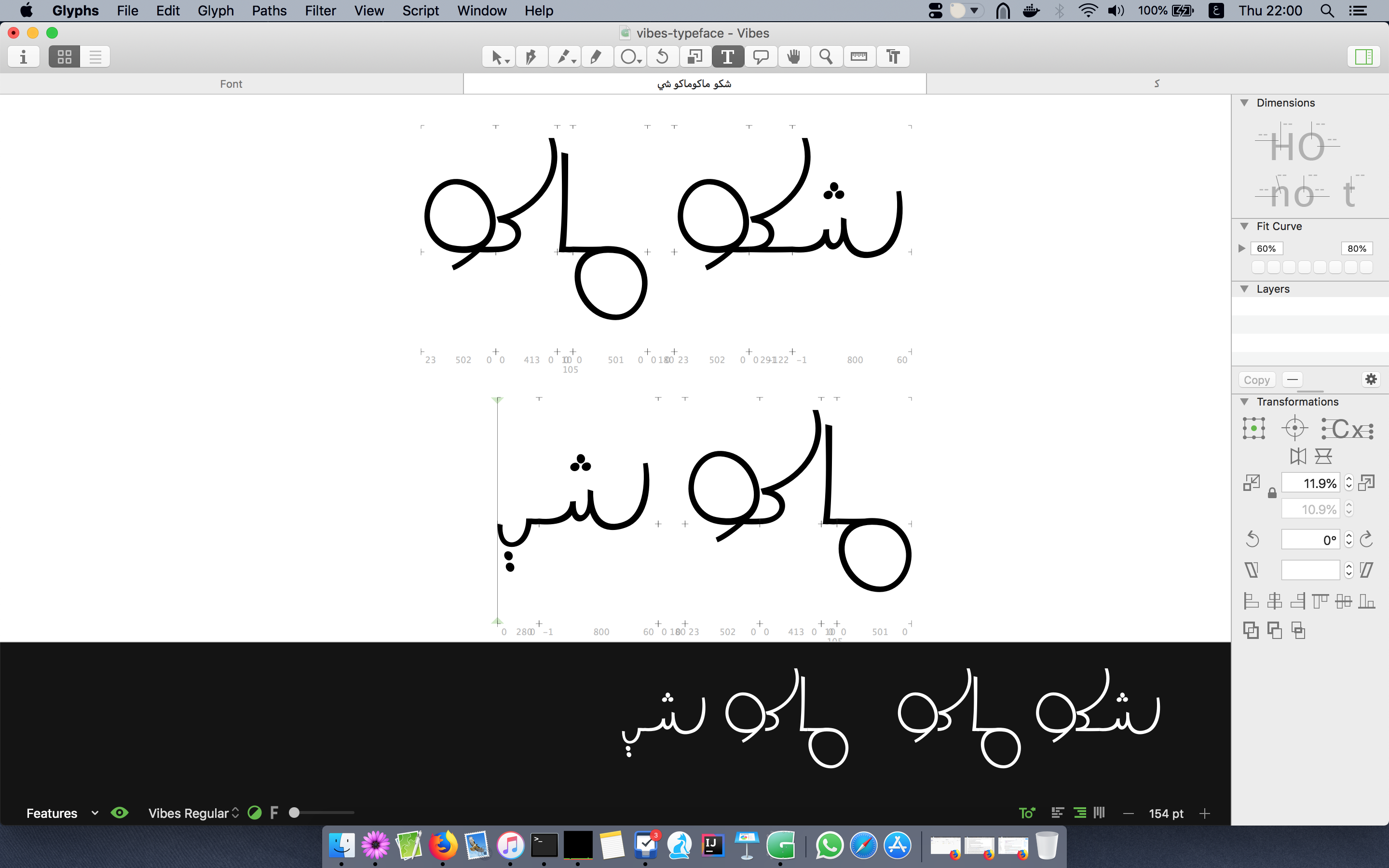

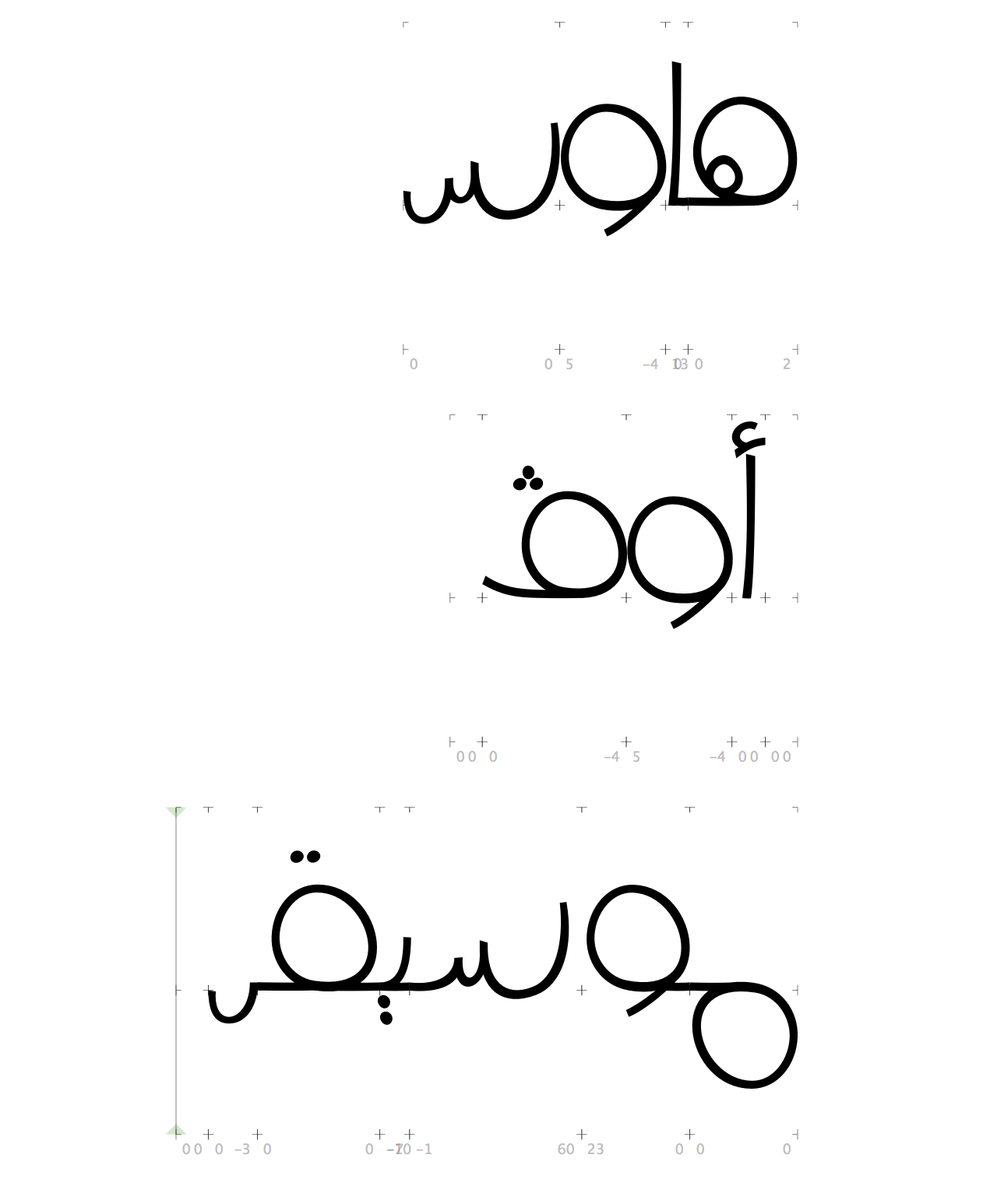
When I was working on Vibes, my first typeface, time was moving very fast, ever faster than software development (type design > coding > design).
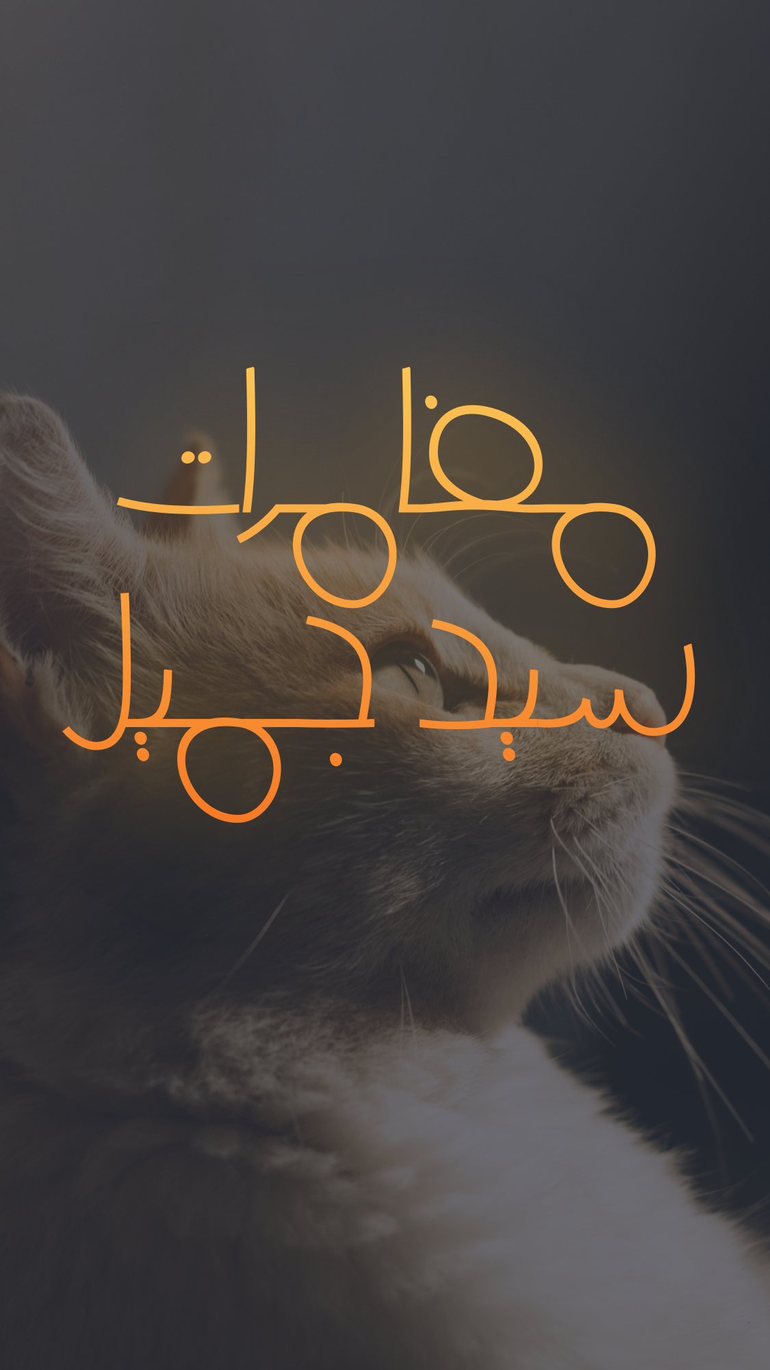
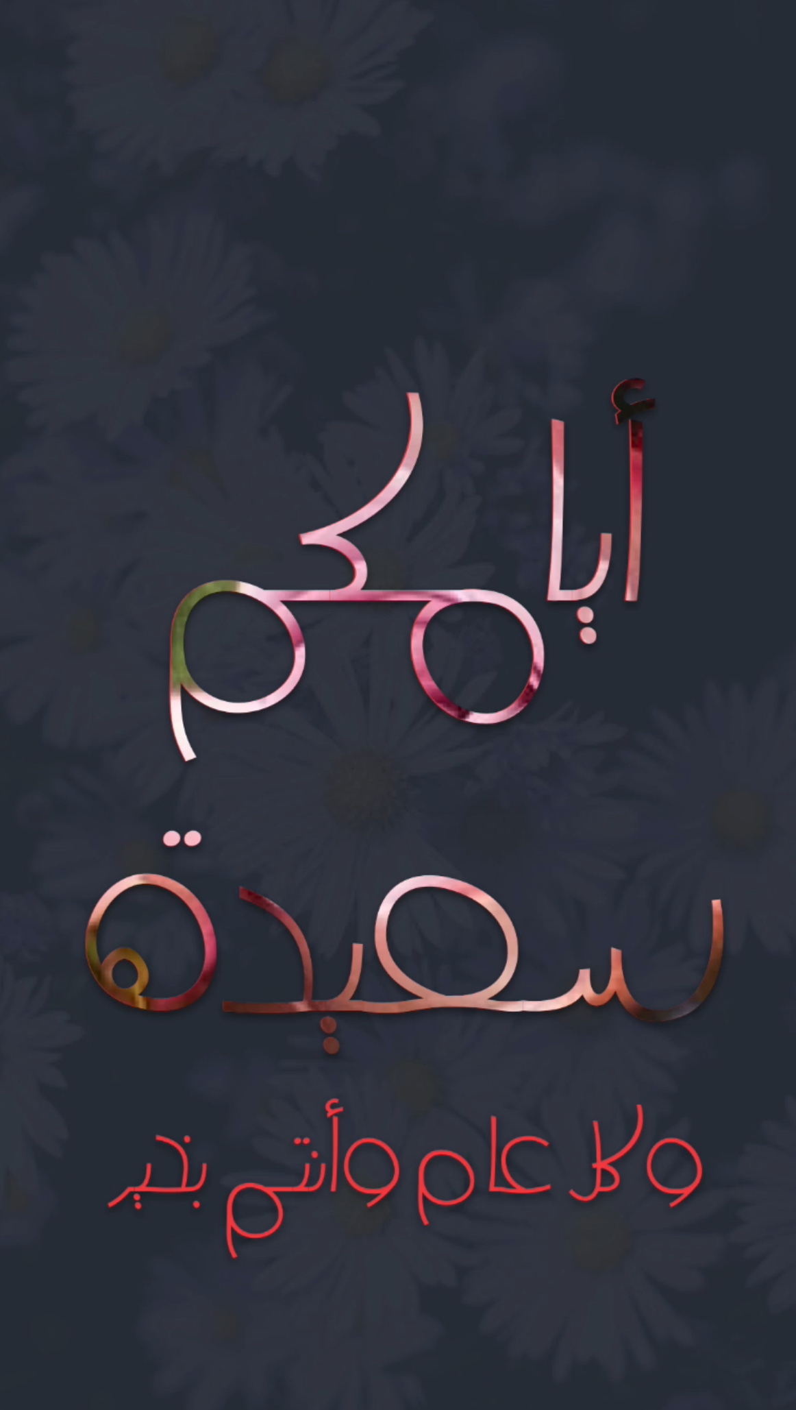
After almost two weeks, and with about 4 hours per day, Vibes can be considered as a typeface (from my own perspective). I started testing texts with it, especially for titles; but it can also be used for body texts, though, it is not legible enought for body texts. After that, Nadine’s touch for enhancing our homeworks took the typeface to the next level. I tested it for some designs. I like it :D.
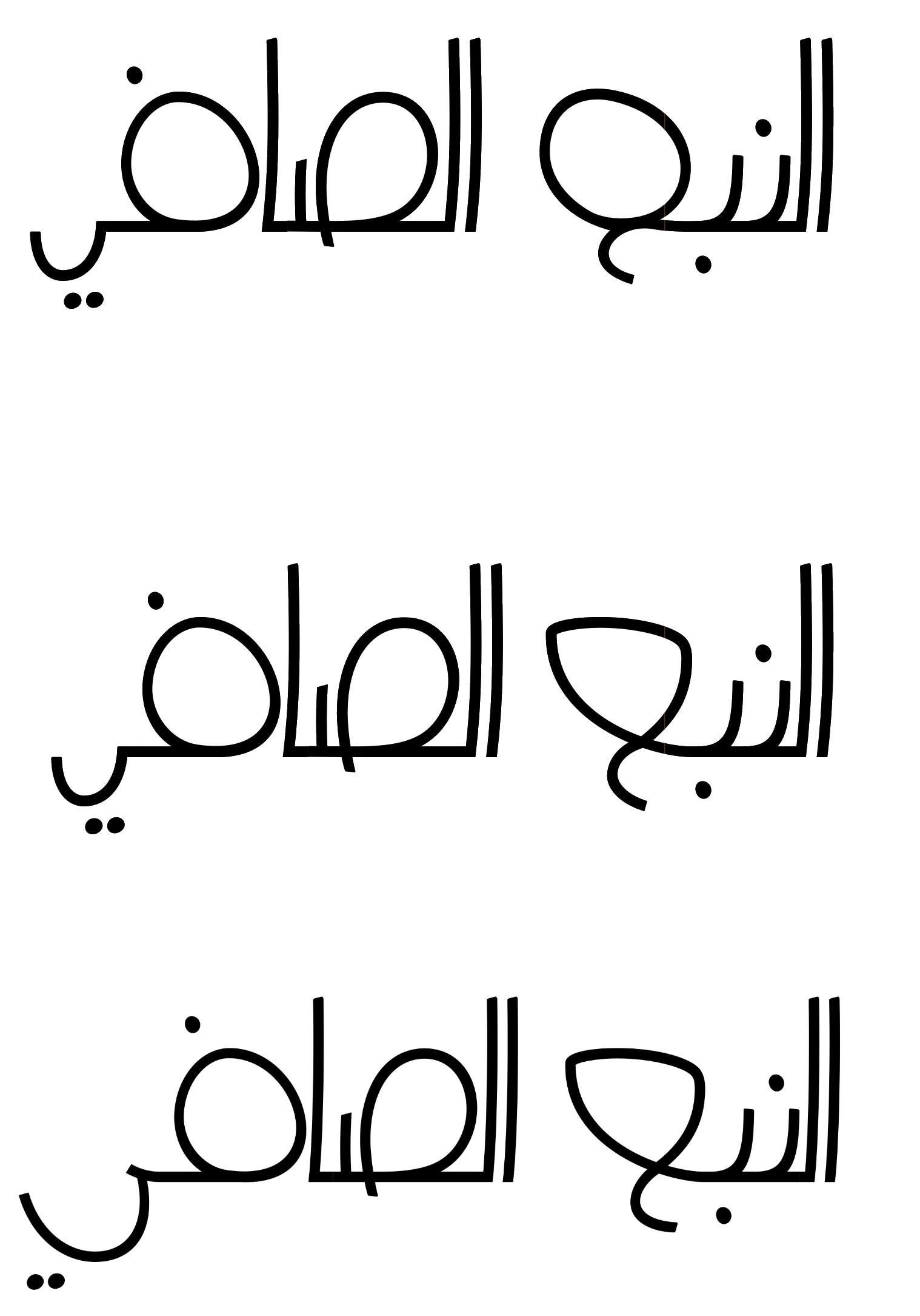
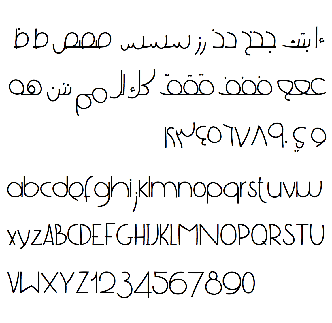
Each glyph gets enhanced progressively. As you can see in the following image, the letter ain (عين), gets enhanced in the second line. The letter yeh-final (ياء مقصورة) also gets enhanced in the last line. This letter, yeh-final gets enhanced by Nadine. The next image has other glyphs, such as heh-final, reh, meem, noon, were all enhanced by her.
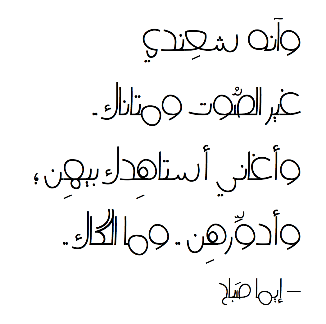
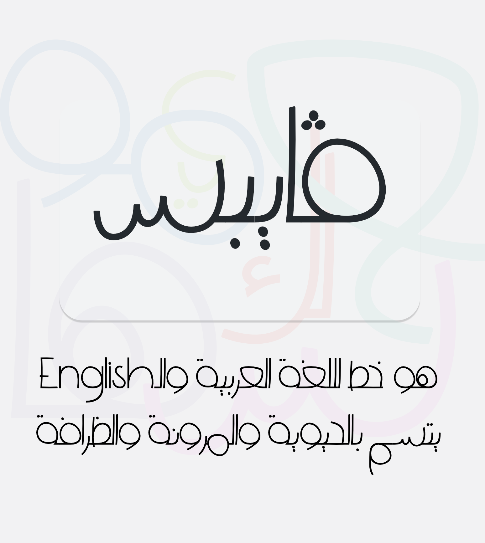
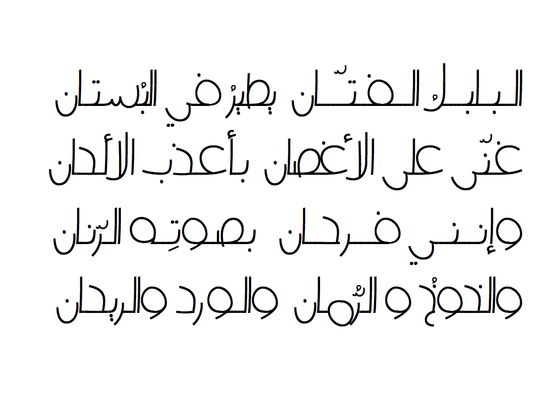
The next phase was to release Vibes to open source. I’ve designed its poster, and some of the texts to show how it can be displayed. After some adjustments and passing checks from Font Bakery, now, and at the time of this article, Vibes has been merged with Google Fonts, by which I am really happy to have my first typeface to be available on this platform. Checkout Vibes on GitHub.
Update: Vibes is now published on Google Fonts at https://fonts.google.com/specimen/Vibes
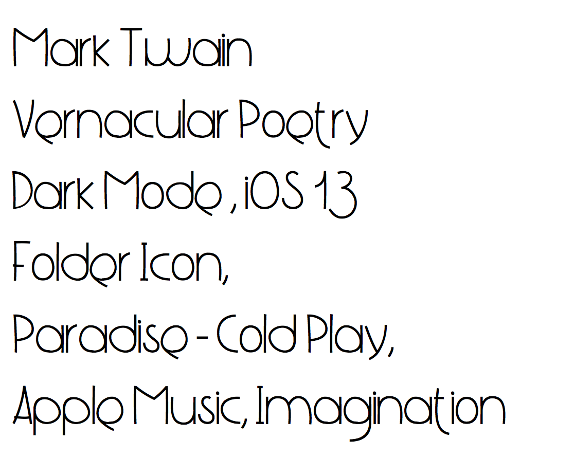
Finals
Before finishing this article, i need to conclude that, Arabic type design course adds a historic milestone to my interest and passion of Arabic type design (again, this is not an ad, but to state the fact). Gratitude to Dr. Nadine Chahine for making this course happens.
Please, don’t hesitate to notify me if there are issues in this article. I hope you find this article helful, or at least learned a little from it.
Resources
May 22, 2019